
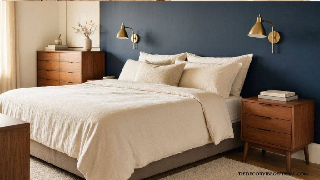
I painted our bedroom accent wall three different colors before it finally felt OKAY. The first was too bright for a room meant for sleeping.I did not like that type . The second was so dark it swallowed the morning light. The third, a muted, dusty blue, finally made the room feel calm instead of just decorated.
That’s the real challenge with accent wall paint colors bedroom owners search for endlessly: the color has to look good and support how the room actually gets used, as a place to unwind, not just a backdrop for photos.
If you’ve scrolled through dozens of paint color roundups and still can’t decide, you’re not alone.
Most guides show pretty photos without explaining why a color works in a bedroom specifically. Below are 35 real accent wall paint colors for bedrooms, organized by mood, along with the details most roundups skip: how light affects each shade, what to pair it with, and mistakes that make a good color choice look wrong on the wall.
What Makes an Accent Wall Color Work in a Bedroom
A bedroom accent wall has one job a living room wall doesn’t: it needs to support rest. Colors that read as calming in daylight can feel cold or flat under lamp light at night, so testing a sample at different times of day matters more here than almost anywhere else in the home.
Sheen matters almost as much as the color itself. A flat or matte finish absorbs light and reads as softer and more restful, while satin or eggshell finishes reflect more light and can make a bold color feel more intense than expected once it’s on a full wall.
Here’s the thing: the most successful accent wall paint colors bedroom designers reach for are usually two to four shades darker or more saturated than the surrounding walls, with a related undertone so the room reads as intentional rather than mismatched. Undertone is the detail most people miss, a “gray” that actually leans green or a “white” that leans yellow can throw off an entire color scheme.
Not sure which overall look fits your bedroom yet? Our guide to home decor styles breaks down the major styles before you commit to a paint color
35 Accent Wall Paint Colors For Bedrooms By Mood
These accent wall paint colors bedroom owners lean on most often fall into a handful of mood categories, which makes narrowing down a shade far easier than scrolling endless swatches.
Calm and Restful
Soft, muted tones are the safest starting point for anyone unsure where to begin, since they rarely clash with existing furniture or bedding.
1. Sage Green : A muted, grayed-out green that reads as grounding rather than bright. It pairs especially well with natural linen and warm wood tones, which keeps the room feeling organic rather than staged.
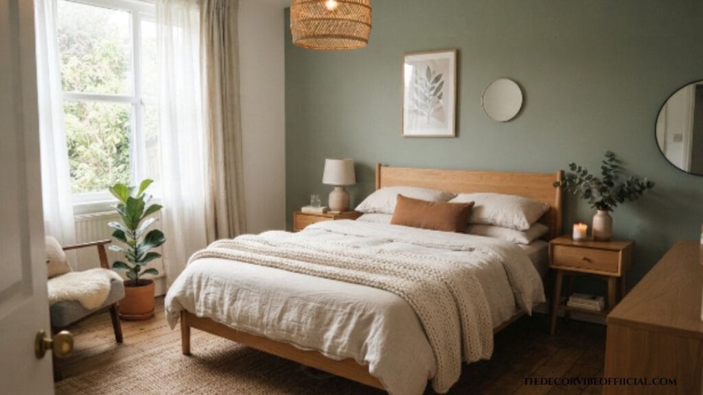
2. Dusty Blue : Soft and slightly faded, ideal behind a bed for a cocoon-like feel. This shade holds up well in both north and south-facing rooms, unlike brighter blues that can shift dramatically with light direction.
3. Warm Greige : A gray-beige blend that stays neutral without feeling cold. It works as a safe accent choice for renters who want subtle contrast without committing to a bold statement color.
4. Soft Lavender : Pale and quiet, works especially well in a room with natural light. In low light it can read slightly gray, so testing the swatch in your actual room is worth the extra step.
5. Muted Sky Blue : Light and airy, good for small bedrooms that need brightness. It reflects more light than deeper blues, which helps a tight room feel less closed in.
6. Pale Eucalyptus : A soft green-gray that pairs beautifully with natural wood. This tone works well year-round, unlike more seasonal greens that can feel out of place in winter months.
Moody and Romantic
Deeper, richer tones suit a primary bedroom especially well, where the goal is often a sense of retreat rather than brightness.
7. Deep Navy : Rich and grounding, one of the most popular bedroom accent choices. It pairs beautifully with brass hardware and warm wood furniture, and it rarely feels dated even years after painting.
If deep, dramatic tones like navy are calling your name, our full guide to moody blue bedroom ideas has even more inspiration for pulling the whole room together.
8. Charcoal Gray : Softer than black, still dramatic against white bedding. This shade gives a room definition without the stark contrast a true black wall can create.
9. Burgundy : Warm and romantic, especially with brass or gold accents. It works particularly well in a room with limited natural light, since the warmth keeps it from feeling gloomy.
10. Plum Purple : Deep and cozy without feeling as heavy as black. Pairing it with cream or ivory bedding keeps the overall palette from feeling too dark.
11. Forest Green : Dramatic and grounding, pairs well with warm wood tones. This color tends to look richer in rooms with good natural light and can appear almost black in dim spaces.
12. Espresso Brown : Rich and enveloping, best in rooms with strong natural light. It creates an intimate, cabin-like feel that pairs beautifully with layered textiles.
Warm and Earthy
13. Terracotta : Warm and sun-baked, adds instant coziness to a neutral room. It pairs especially well with white oak furniture and woven natural fiber accents.
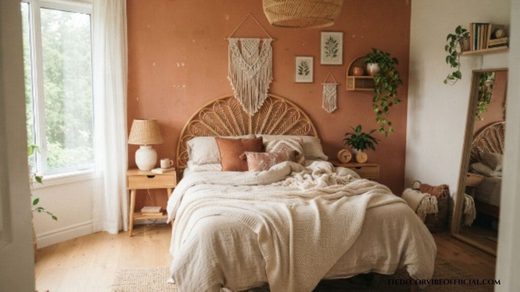
14. Clay Rust : Deeper than terracotta, works well in a boho or vintage-style bedroom. This shade can shift toward pink in cooler, north-facing light, so a sample swatch is essential before committing.
15. Ochre Yellow : Warm and grounding, best used in a muted rather than bright shade. A softer, more toned-down version avoids the overly cheerful feel a bright yellow can bring to a sleeping space.
16. Warm Taupe : A soft, brown-based neutral that reads as calm and sophisticated. It works as a flexible base color that pairs with nearly any accent metal finish or textile color.
17. Cinnamon Brown : Cozy and enveloping, pairs beautifully with cream bedding. This tone adds warmth without the visual weight of a true dark brown or espresso shade.
18. Muted Mustard : A toned-down yellow that adds warmth without overwhelming. It works especially well as a smaller accent, like a headboard nook, rather than a full wall in a compact room.
Soft Pastels
19. Blush Pink : Warm and soft, especially elegant with brass or black accents. This shade has moved well beyond a nursery color and now reads as genuinely sophisticated in an adult bedroom.
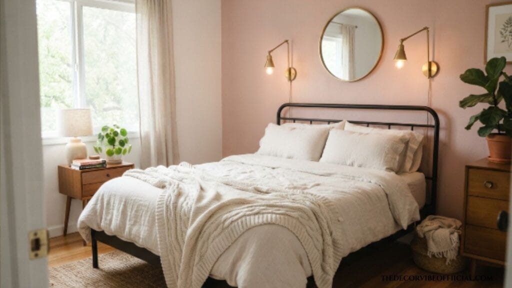
20. Powder Blue : Gentle and calming, works well in coastal or cottage-style bedrooms. It pairs naturally with white trim and natural fiber rugs for an unfussy, relaxed feel.
21. Pale Mint : Fresh without being cold, pairs nicely with warm wood furniture. This tone works best in rooms with ample natural light, since dim spaces can make it read slightly flat.
22. Soft Peach : Warm and gentle, adds a subtle glow in morning light. It’s an easy shade to layer warm metals and cream textiles against without much risk of clashing.
23. Dusty Rose : Slightly deeper than blush, reads as more grown-up and less sweet. This shade pairs especially well with sage green and warm wood accents for a garden-inspired palette.
Modern and Graphic
24. Matte Black : Bold and dramatic, best in rooms with strong natural light. Without enough light, a fully black wall can read as heavy rather than intentional.
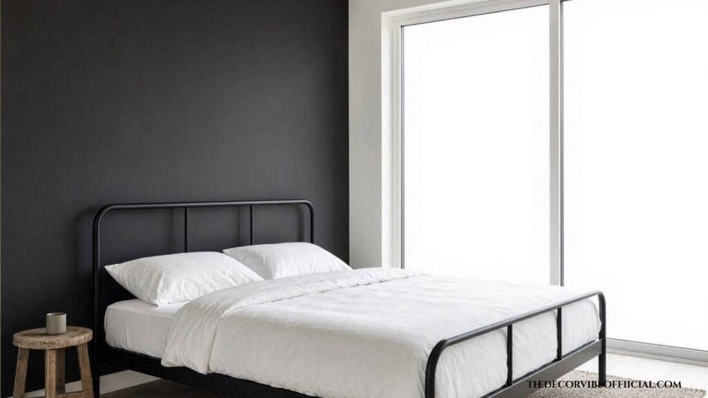
25. Cool Gray-Blue : Crisp and contemporary, pairs well with black hardware. This shade suits a minimalist bedroom that leans more architectural than cozy.
26. Warm White ; A subtle tonal accent for a minimalist, monochrome bedroom. Using a slightly different sheen on the accent wall, rather than a different color, creates a quiet effect that still reads as intentional.
27. Deep Teal : Rich and modern, especially striking against brass fixtures. This color bridges blue and green, giving it more flexibility than either shade on its own.
28. Graphite : A cooler, more industrial take on charcoal. It pairs particularly well with black steel-frame furniture and concrete-look accents.
Coastal and Airy
29. Seafoam Green : Light and fresh, pairs beautifully with white and natural wood. This tone works especially well in a room with an ocean or garden view, extending that outdoor feel indoors.
30. Soft Aqua : Bright without being harsh, works well in sunny bedrooms. It holds its color well under strong natural light, unlike some pastels that can wash out.
31. Sandy Beige : A warm neutral that evokes a beach-adjacent calm. This shade pairs naturally with woven textures like rattan, jute, and linen.
32. Pale Denim Blue : Slightly deeper than powder blue, still gentle and relaxed. It works well layered with white bedding and warm wood tones for an easy, unfussy coastal look.
Bold Statement Options
33. Emerald Green : Rich and jewel-toned, best as a smaller accent rather than a full wall. Using it on a headboard nook or behind open shelving keeps the intensity in check.
34. Deep Aubergine : Dramatic and moody, pairs beautifully with warm wood and brass. This shade reads as almost black in low light and richly purple under warmer bulbs, so lighting choice matters as much as the paint itself.
35. Rich Cobalt Blue : Bold and saturated, works best in a room with plenty of white trim to balance it. This is one of the boldest options on this list, so most homeowners find it works better as a smaller accent than a full wall.
Real Paint Names to Bring to the Store
Most roundups skip actual brand names, so here’s a starting list of real, widely stocked shades to ask for.
| Mood | Paint Brand | Shade Name |
|---|---|---|
| Sage Green | Benjamin Moore | October Mist |
| Deep Navy | Sherwin-Williams | Naval |
| Terracotta | Farrow & Ball | Red Earth |
| Blush Pink | Benjamin Moore | Marry Me |
| Charcoal Gray | Sherwin-Williams | Iron Ore |
| Matte Black | Sherwin-Williams | Tricorn Black |
| Warm Greige | Sherwin-Williams | Agreeable Gray |
| Deep Teal | Benjamin Moore | Newburg Green |
Bring a large sample card home and tape it to the wall at different times of day before committing to a full gallon. Accent wall paint colors bedroom owners choose without testing under both natural and lamp light are the ones most likely to need a repaint within the year.
Where to Shop for Bedroom Accent Wall Paint
Major hardware stores carry all of the mainstream brands listed above and typically offer free digital color matching if you bring in a swatch from a specialty brand like Farrow & Ball. For a true test, order a large peel-and-stick sample rather than relying on a small paint chip, since bedroom lighting tends to be warmer and dimmer than a store’s fluorescent lighting. Look for a scrubbable, low-VOC finish for durability, especially in a room where bedding and furniture regularly brush against the wall.
Real Bedroom Examples By Color
Seeing a color in context makes it easier to picture in your own space.
Bedroom: Small City Apartment Look: Muted sky blue behind the headboard, white linen bedding, natural wood nightstands, brass reading sconces.
Bedroom: Primary Suite Look: Deep navy on the headboard wall, warm walnut furniture, brass hardware, and a cream wool rug.
Bedroom: Boho-Style Guest Room Look: Terracotta accent wall, rattan headboard, layered cream and rust textiles, and woven pendant lighting.
Bedroom: Modern Minimalist Bedroom Look: Matte black accent wall, crisp white bedding, black metal bed frame, and a single oversized window left uncovered.
Common Mistakes to Avoid
A few small missteps show up again and again when choosing accent wall paint colors bedroom projects end up regretting.
- Skipping the sample test. A color that looks perfect on a paint chip can shift dramatically under real room lighting.
- Ignoring undertones. A gray that leans green or a white that leans yellow can clash with existing furniture and bedding.
- Choosing a color too close to the room’s other walls. Without enough contrast, the accent wall loses its purpose entirely.
- Going too bright for a bedroom. Highly saturated, energizing colors work against the room’s purpose as a place to rest.
- Forgetting the ceiling and trim. A bold wall color needs a plan for how it meets the ceiling, or the room can look unfinished.
- Rushing the prep work. Skipping primer on a dramatic color change, especially over an existing dark or bold wall, often means needing extra coats to get true, even coverage.
- Choosing sheen without thinking it through. A glossy finish on a bold, dark color can look uneven under artificial light, while a flat finish on a light color may show marks more easily over time.
Small Bedroom vs Large Bedroom Color Strategy
Room size changes which accent wall paint colors bedroom spaces can comfortably handle.
In a small bedroom, lighter and cooler tones, soft blues, sage greens, pale grays, tend to keep the room feeling open rather than closing it in. In a larger bedroom, deeper and more saturated colors, navy, charcoal, forest green, have enough room to feel intentional rather than overwhelming, since the extra square footage balances out the visual weight. Ceiling height plays a role too. A bedroom with low ceilings generally benefits from keeping the accent color off the ceiling itself, while a room with taller ceilings can often extend a bold color upward for added drama without the space feeling closed in.
If paint isn’t quite the texture you’re after, our wood slat accent wall ideas covers the same headboard-wall concept using real wood instead.
Frequently Asked Questions
What is the most popular accent wall color for a bedroom?
Navy and sage green remain two of the most consistently popular accent wall paint colors bedroom owners choose, since both read as calming rather than energizing.
Should a bedroom accent wall be light or dark?
Both work, depending on room size and natural light. Smaller or darker rooms generally do better with lighter tones, while larger, well-lit rooms can handle deeper, moodier colors.
Which wall should I paint as the accent wall?
The wall behind the headboard is the most common choice, though a wall with architectural interest, like a fireplace or built-in shelving, also works well.
How do I know if a color will look too dark once it’s on the wall?
Paint a large sample swatch, at least two feet wide, and check it at different times of day before committing to the full wall.
Do accent wall paint colors need to match the rest of the house?
Not exactly. The color should relate to the room’s existing tones, undertone and mood, but it doesn’t need to match other rooms in the home.
Wrapping Up
The right accent wall color does more for a bedroom than almost any other single change, and these 35 accent wall paint colors bedroom owners can choose from show just how many directions that choice can take, from a soft, restful sage to a bold, dramatic cobalt. The goal isn’t to pick the trendiest shade. It’s to pick the one that makes the room feel like somewhere you actually want to fall asleep. Next time you walk into a bedroom that feels instantly calming, there’s a good chance the wall color is doing more of that work than anyone realizes.
